Highrise Contacts
An exploration of the Highrise contacts screen
designed by Jason Zimdars
In the spirt of 37signals’ design decisions posts on Signal vs. Noise, I wanted to share a bit of my design process and the iterations that were arrived upon during this exploration.
Tags
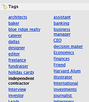
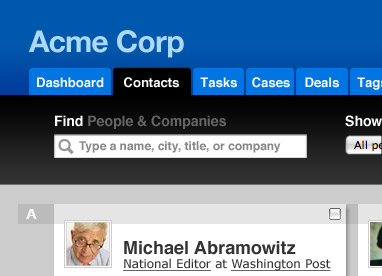
The first task I tackled was the list of tags on the contacts screen. Jason described it as a “complete mess” once you’ve added more than a dozen or so. My first step was to dig into various design pattern references to see how this problem has been solved by others. However, this route left me without any feasible solutions; tag clouds are a common pattern that would only exacerbate the problem here. So, I dove in and started playing with the tags in Photoshop. My first instinct was to get away from the comma-separated list and try to organized the tags.
The first idea was to render the tags in columns. This added a nice visual line which helps the eye to scan more quickly. It was a start, but not visually interesting.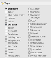
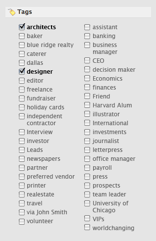
Building on that I briefly played with checkboxes which allow people to easily choose tags and see which are active. This method would also make selecting multiple tags more clear than the existing method.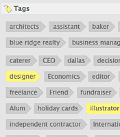
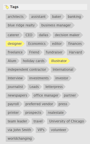
Still not happy with this I went back to the cloud format but explored using icons to separate the individual items, and eventually this concept which uses a tag-shaped graphic for each item. I liked where this is going with the directional movement, but I really was stuck on the columns.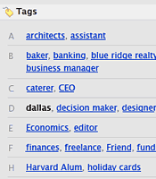
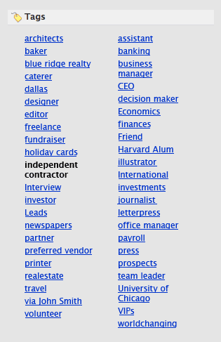
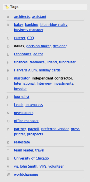
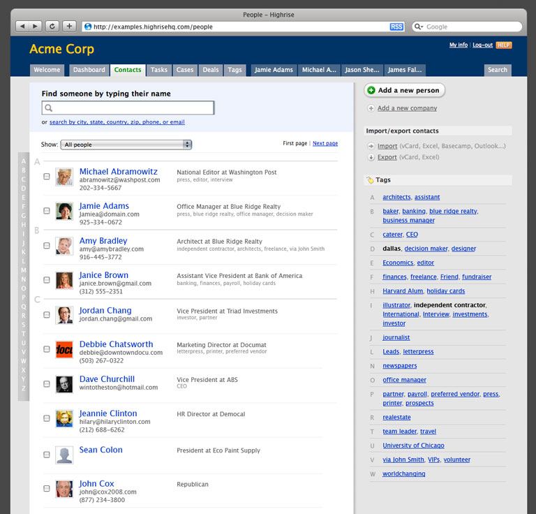
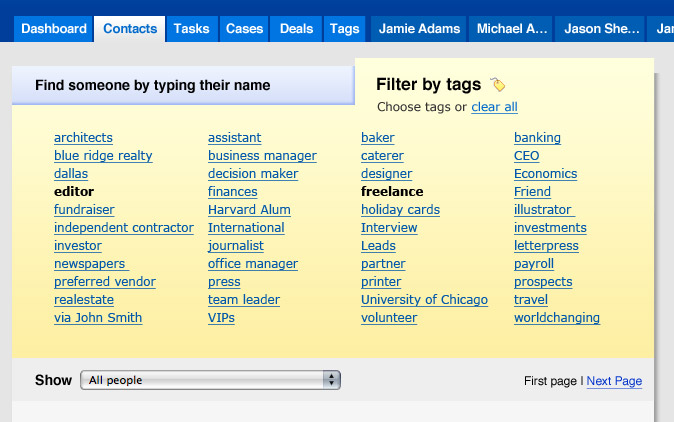
Back the column layout. I came up with the idea of using some horizontal separators and a left aligned letter to separate the tags alphabetically. Now, I had something that could work. I like that this breaks the list into smaller groups which lets the eye quickly jump to a group even when there are lots of tags.
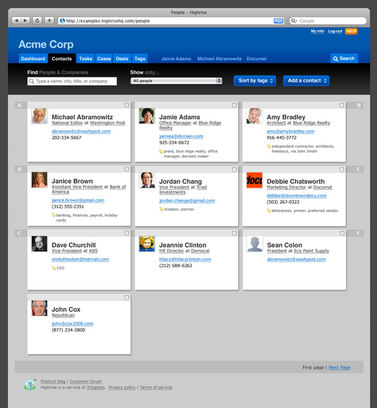
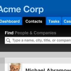
Contact list
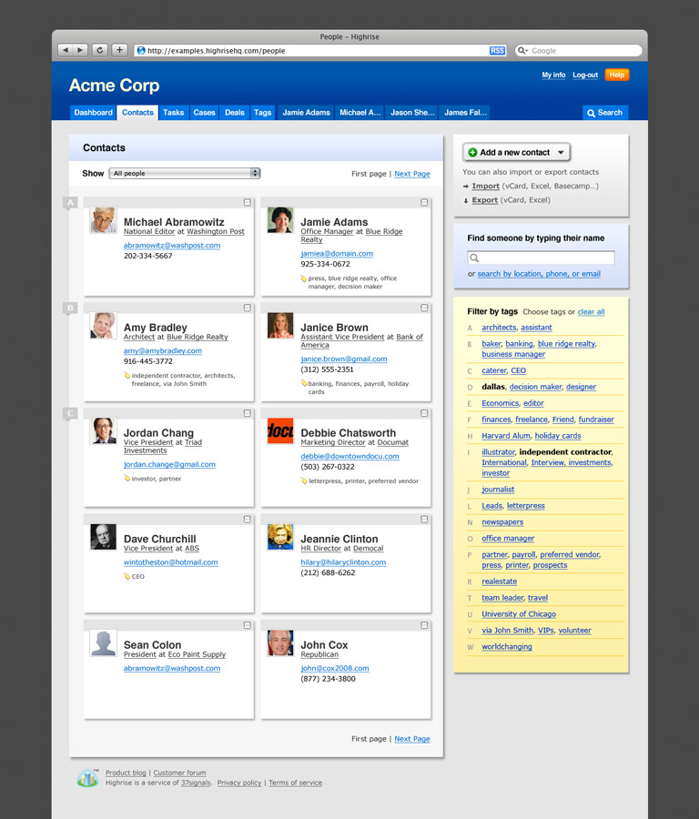
Once I had a solution for tags that I liked, I immediately thought of ways to use this treatment with the contact list. Since Jason asked me to take a look at that, too, I went right to work. In some ways, the contact list has similar issues with quick scanning. I kept thinking of a heavy user that has tons of contacts, is on the phone (distracted), and just needs to find a phone number quickly. He needs to way to quickly jump to the contact he's looking for. I liked the idea of adding the horizontal separators and call-out letters to the left side of the list to group the contacts and make it easy to spot the group your’re looking for as you scroll. A further iteration of this concept added another alphabetic navigation outside the frame of the page. This would let a user click a letter to jump right to that group. It could even slide along with the user as they scroll.
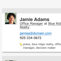
One more tweak was to the way the contacts information is organized. The tags for each contact felt awkward as they end up forming these heavy clumps on the right side of the list. They are hard to read and generally break the clean lines of the rest of the list. So I moved them to a single line under the company name and title. I liked the idea of creating two vertical scanning columns. One for scanning by name, and the other by title and/or company. I also liked that this kept the association between name and title as they stayed on the same horizontal line.
So, at this point I felt like I had an answer to Jason’s first question, “What would you do with what we have now?” I had a solution that felt at home in the 37signals suite of applications but added some much needed visual organization to some of the most dense information in any of the apps.
Not quite satisfied
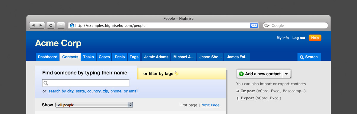
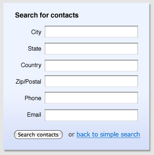
I felt like I had a pretty good solution that worked with the existing look and feel but I wanted to keep exploring. The tag list still took up a lot of vertical space and the new treatment added to the overall visual complexity of the page. I wondered if the tag list had to be visible at all times or if we could hide it until needed. A solution was to split the top of the contact list into two tabs — one for the search function, and another for the tags.
On this iteration, I also started to break out of the existing look at feel. The first switch was fonts. I choose a combination of Verdana for most text and Helvetica for the larger headlines. This allows for more dramatic contrast than the existing Lucida Grande. I was partly inspired by the HTML emails as seen in 37signals’ newsletters — I love the brighter, cleaner look of these pieces. Similarly, I took the opportunity to add some height to the header to make it a more pleasant proportion and brighten up the color palette. I feel like the current look is a little drab and this set of brighter colors really makes the application feel more inviting.

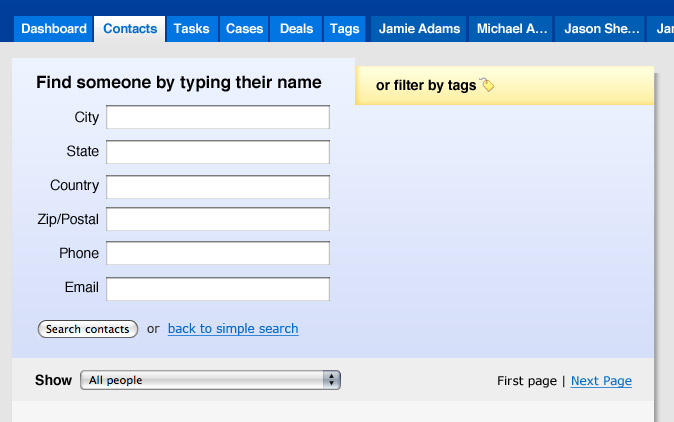
When clicked, the advanced search expands the blue tab.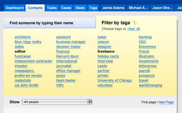
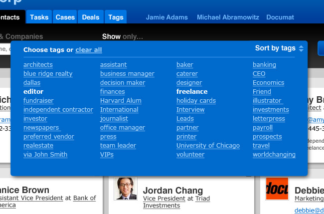
The tags are displayed when you switch to the filter by tags tab.
Further explorations
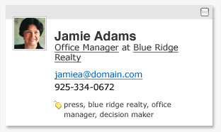
On this next version I wanted to take the opportunity to further explore the contact list now that I had more typographic options. I wanted to try rendering the contact list more like business cards or cards in rolodex. The end result is pretty nice and doesn’t require as much additional vertical space as you might think. I pretty much stuck with this look throughout the rest of the process and even adapted it to the existing design. In this step I also tried to put both the find and tags pieces into the sidebar. I noticed that the contacts screen was really the only one that veered from the convention of having the screen name in the blue bar at the top of the left side. So I tried to bring this screen back inline and move both pieces to the right side. I like the clearer look at the top of the contact list and the visual interest the right side items gained, although the tag list is still a bit busy.
Each contact is rendered as a card that resembles a business card.
The search tag still expands much like the previous iteration.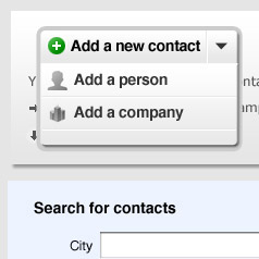
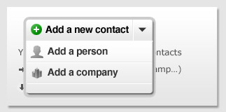
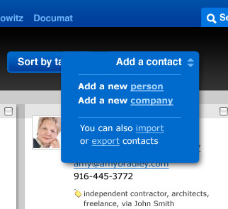
I also explored a simpler way to display the add a contact information
Last one
I couldn’t complete this exploration without trying something completely different. The business card contact list format can really benefit from additional horizontal space so I tried a layout without the ubiquitous 37signals shadowed left content column. To support this idea I created a contextual action bar under the tab menu that contains all of the functionality for the page.
I wondered if we could have a find function that searched all fields without a need for the advanced search form. For example, a search for “cal” might return a contact named Cal Ripkin and two contacts in California and filter the contact list live on the page.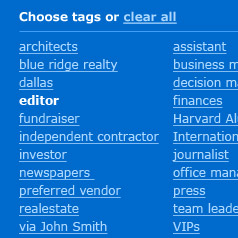
Here the sort by tags button expands to show the UI for choosing tags by which to filter the contact list. I see no reason that a person could not click multiple tags right here.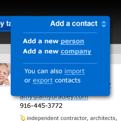
Clicking the add a contact button expands the offer the options to add a person, company, or see the import/export links.
Conclusion
I truly enjoyed this project, immersing myself in this problem and seeing where the exploration would take me. I appreciate the opportunity to share my ideas for this design with you and look forward to talking more.